Form vs. Function
As a UX Designer, I constantly need to find the balance between aesthetics and usability: the classic debate of form vs. function. But after years in this profession I’ve realized that form and function are not so different.
A great example is “Affordance”, which is an important principle in UX field. It means the visual appearance of a thing indicates how that thing behaves and should be used. It ties form and function together and guides design decisions throughout a project. When done correctly, the product feels natural and intuitive.
When it is clear why something looks a certain way, the design feels like an extension of the functionality. If that functionality makes a user very happy, they grow to love the design, transcending personal taste and bias.
This leads us back to the Cybertruck. For physical products the principles are the same - form should be tied to function. At first glance this doesn’t seem to be the case. How could this be a pickup truck that does pickup truck things, when it looks so wildly different from every other truck we’ve seen? That disconnect is actually based on an assumption that all other trucks are perfectly designed for the functionality they offer. I’ll explain why that assumption is wrong.
The “First Principles” Approach
One thing that Elon Musk, CEO of Tesla, does very well is building from the ground up, questioning existing assumptions along the way. That’s something that resonates with me as well regarding my work - asking “why” over and over again until you piss off people is the most effective way of addressing a core issue rather than build on top of an imperfect system. First, you find out what the fundamental truths are, and then reason upwards from there. The alternative approach is to reason by analogy - to look at what’s been done before and try to do it better. The First Principles approach led to Musk designing reusable and vastly cheaper rockets, a brand new ‘skateboard’ chassis for Tesla vehicles, and so on. The results range from being similar to existing products or very different, depending on how much room for improvement there is. The fact that the Cybertruck looks so different than all other trucks is a sign that they’ve found a much better way. Let’s dive into the big departures from existing truck design.
Exoskeleton
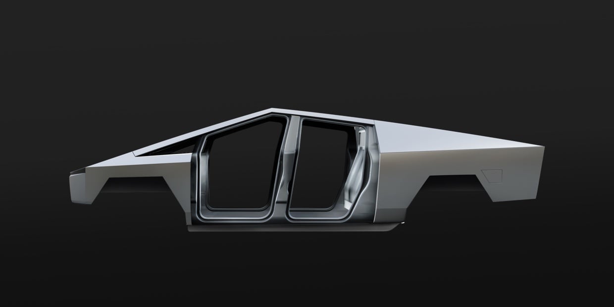
Work trucks take a beating. Flying rocks, tools banging against the sides, etc. Over time trucks accumulate a lot of dents and scratches, which can be costly to repair. Tesla is solving this problem by putting the structural frame on the outside of the truck. By using a 3mm thick “Ultra-Hard 30X Cold-Rolled Stainless Steel” unibody design, they’re able to provide scratch and dent resistance without greatly increasing the weight.
There are design consequences for this decision however. The steel is too strong to be shaped with a stamping press, making it so only flat planes can be used for the design. Also, the triangle shape of the frame is necessary, using geometry for structural strength. This is a great example of form and functionality being married together. Many people don’t like the planar look, but if they love the dent and scratch resistance, they’ll grow to like the planar design. It feels more natural when you know why it was done.
The strength isn’t the only consideration here though. The use of steel removes the need for expensive stamping machines. Also, it turns out that polished steel looks great without paint, which removes the need for a paint shop in the assembly line. Both of these factors reduce costs, giving consumers more for their money.
With this decision, Tesla is offering better durability and lower costs, and the result is a planar design. This is a tradeoff that makes perfect sense, given the use case for trucks.
Off-Roading
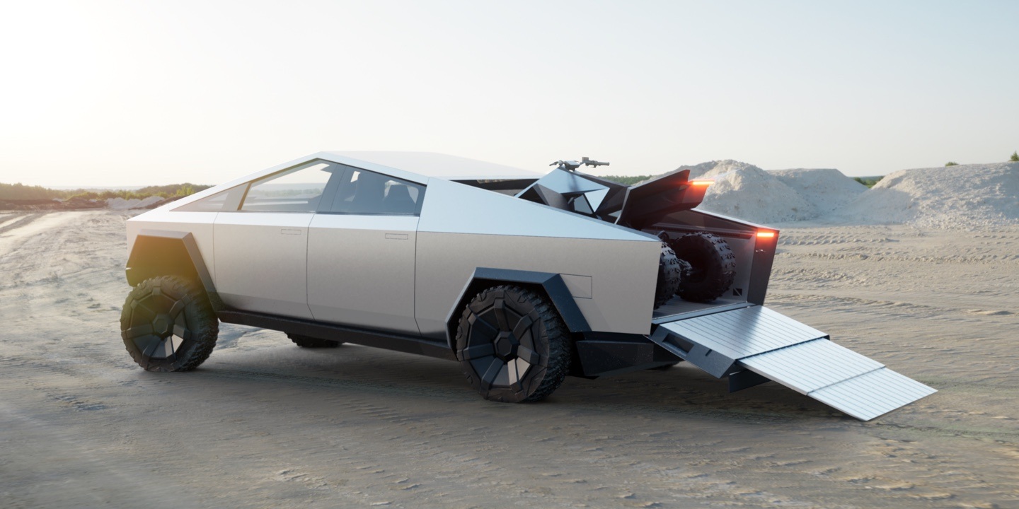
A few of the most important factors of offroading vehicles are approach / departure angle, torque, visibility, and ground clearance.
First of all, the Cybertruck is an EV, giving it instant torque. Rather than having an engine up front, the battery and motors are built into a ‘skateboard’ chassis below the truck, giving it a low center of gravity. But more importantly for this article, this different distribution of bulk unlocks a lot of potential for redesign.
Take a look at the Cybertruck side profile and you’ll notice the hood slants down, there’s a huge front windshield, and the wheels are very close to the front. This gives it some strange proportions compared to existing trucks, but there’s a reason for everything.
With no engine in the front, the driver can sit farther forward, giving greater visibility, and the front wheels can move up, giving the truck a 35º approach angle.
Tesla has opportunities that little manufacturers have had before. Following the status quo would have meant giving up on the potential for this truck. Tesla chose to maximize this potential, trading standard truck appearance for better features.
That triangle though...
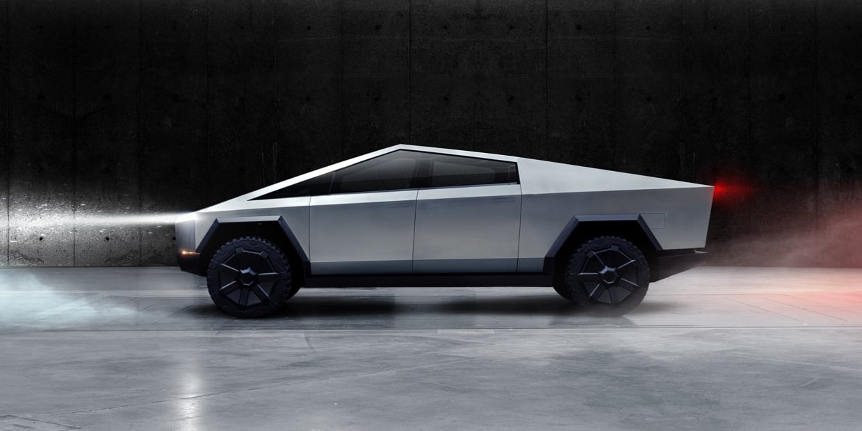
One major complaint I've heard about the design is the triangle roofline. That one got me too - The cab and bed shape of typical trucks is one of the defining features.
As mentioned before, the triangle roofline helps with structural strength. But it also fixes a major problem with existing truck design: bad aerodynamics. When the airflow separates from the skin of a vehicle, it creates turbulence and drag.
The Cybertruck features a retractable bed cover. When deployed, the airflow passes smoothly over the top of the truck, helping with aerodynamics. This in turn reduces driving costs for customers. It also allows customers to use the bed for storage without worrying about theft.
Again, Tesla is throwing past assumptions out the window in favor for better functionality. And with that, comes change.
Alright, let’s talk aesthetics
When designing anything, you should never design for your personal tastes - always design for the target audience and for the environment in which a product will be used.
Target Audience
Pickup truck owners are overwhelmingly (84%) male, and these guys are the manly, DIY, experiential types. They buy trucks to either get work done, go offroading, or future-proof themselves for any task that comes their way. They care about what the truck can do, and they want the look and feel to embody that attitude.
At first glance, the Cybertruck looks like a lot of nonsense - designed to look cool and edgy over any other reason, which would be pretty silly. That’s the first impression, but when you realize that solid steel plates actually provide more durability than chrome-painted plastic fenders, you start to see other trucks in a different light - more about looks than capability. When you realize the alternative is paying thousands of dollars more to get a truck with curvy edges, you start to question if that’s the right move for the manly, practical type of guy that you are.
At the end of the day, whether the angular design appeals to the target audience’s personal taste or not, the Cybertruck’s existence highlights how much unnecessary decoration other trucks have, making them feel a bit gaudy.
Environment
The other consideration is how and where the product will be used, which greatly affects how it should be designed. In the UX field for example, if a mobile app will be used outdoors, you have to pay close attention to the contrast of elements because your users will be dealing with screen glare. If your app will be used mainly at night time, choose a dark mode to match the environment and reduce eye strain. You get the point.
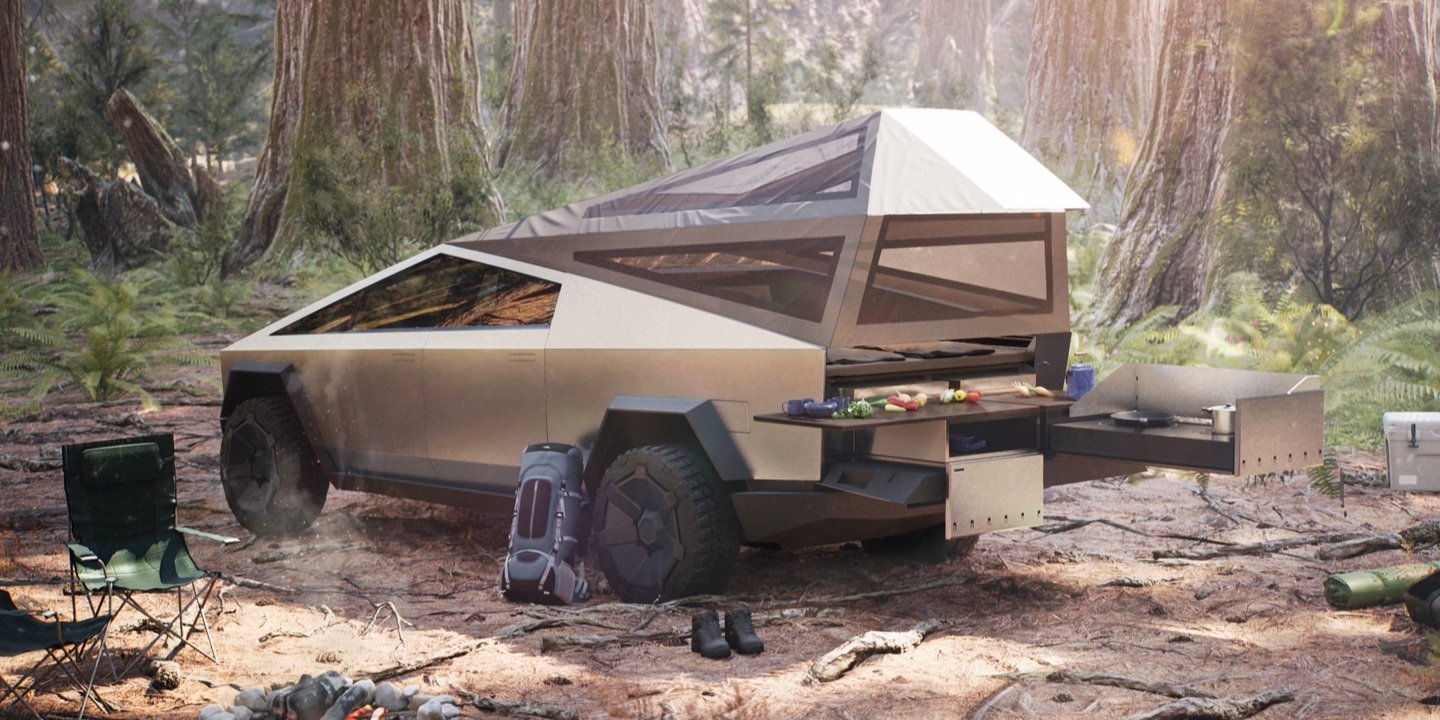
Pickup trucks are way more popular in rural areas than cities. This is the primary environment, surrounded by the organic shapes of nature, not the polished industrial look of cities. It’s clear that the design team took this into account. The Cybertruck looks rough and sloppy next to fancy cars and buildings, but put it on a dirt road and the juxtaposition is real. It looks like a gleaming, futuristic tank, ready to take on the world in style.
Aesthetics and Proportions Now that we’ve covered everything, I’ll give my honest opinion about the design style.
Even with functionality dictating so much of the design of the truck, there is still a bit of wiggle room to style and polish the product. I think one of Tesla’s goals was to differentiate this truck from the rest, using that wiggle room to push the edginess. While I don’t fully agree with this decision, I can see why they did that: It is polarizing and divisive, some love it and some hate it, but one thing is sure, absolutely nobody can ignore it. There is a certain appeal to owning something so provoking, which may end up being another driver for purchases.
However, even after diving in and learning about the reasons for the design, there are still aspects that bother me. I would like to see Tesla take this initial design and refine it before production begins. The hexagonal wheel wells seem clunky and out of place, there is a lot of tension created with the tight spacing of the front wheel, and some of the lines (such as the windshield and front wheel) could be tweaked to line up better and feel more purposeful. A few minor improvements, along with the modifications they’ll have to make for legal reasons (e.g. side mirrors), will help the truck ‘feel right’, even if the style is a huge shock.
Final Thoughts
First of all, I want to give props to the design team. It’s easy to make minor improvements on an existing product, but insanely difficult to reimagine something from the ground up, especially when the current design has been set in stone for 100 years.
If the Cybertruck was designed this way for the hell of it, I don’t think it would be successful. It’s not easy for people to get used to such a big change. But there were compelling reasons for every major design change, unlocking functionality that no other manufacturer can hope to match without making major changes themselves.
Because of this, I predict that within 5 years we will be seeing similar trucks from other manufacturers, and the Cybertruck will go down in history as a game changer that brought about a new trend of truck design. They won’t look exactly alike, but we’ll definitely be seeing a greater variety of designs, which is great for the industry. By taking the Cybertruck to the extreme, Tesla actually opened up freedom for themselves and other manufacturers to innovate without fear of shocking the market in the future.
The original question was "Is the Cybertruck ugly or beautiful?". At first glance it's ugly because it's so different, but once it sinks in, it progressively becomes better looking. The truck isn't physically changing; you are. Beauty is subjective, but not if Tesla has anything to say about it. The Cybertruck forces viewers to check their assumptions and broaden their perspectives. That's pretty damn impressive.


