Kelloggs' user experience guidelines
Kellogg's user experience for it's many brand websites was inconsistent and had quality issues due to the large number of design agencies working on them. We created a set of UX best practices, principles, and guidelines for their agencies to follow.


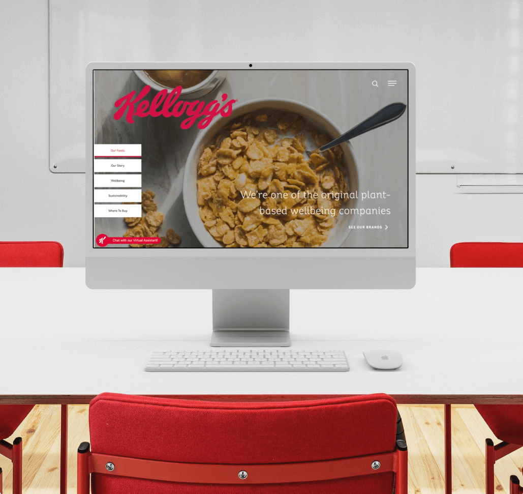
Revamping Kellogg's Web Presence
We provided Kellogg's with full solution user experience resources in order to assist them in streamlining their digital brand presence across multiple websites.
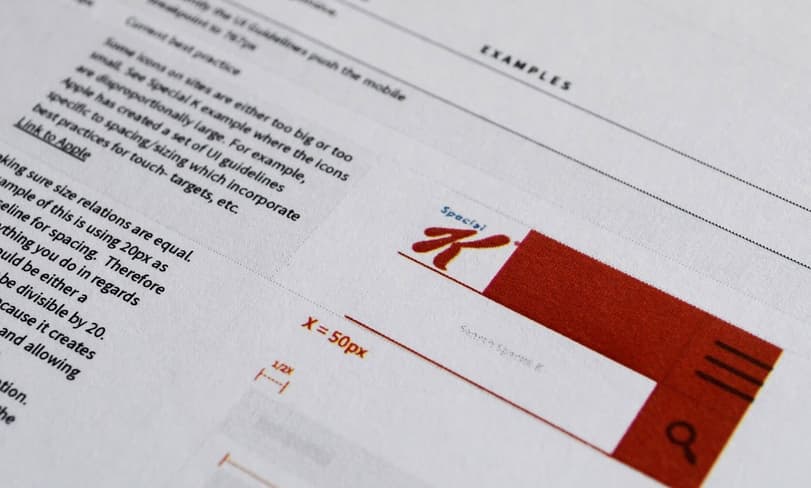
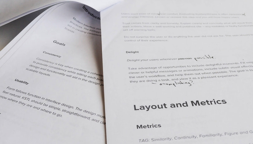
We started with tons of research, copywriting, content structuring, and strategy. We categorized main areas of usability, tested existing Kellogg's sites against them, documented our findings, and created guidelines to fix the issues we found.
We referenced Kellogg's current websites in the guideline topics to make sure the content would be useful and appropriate.

Once we had everything planned out and organized we focused on copy and content
It ended up being a 20+ page document for the text alone.
Once the copy and content was finished we created wireframes for the site, making sure navigation was intuitive and information was easy to find.
We designed according to the rules we just made, and kept everything as simple and basic as possible. The designs were meant to be an example of the guidelines themselves - a framework that doesn't stifle creativity and leaves plenty of room for a unique design.

Expertise used
The design
We designed according to the rules we just made, and kept everything as simple and basic as possible. The designs were meant to be an example of the guidelines themselves - a framework that doesn't stifle creativity and leaves plenty of room for a unique design.
We included design principles / fundamentals and tagged each rule throughout the guidelines with the design principle(s) it relates to. This helps give context, and helps with adoption since people will be more likely to take something seriously if they know the reasoning behind it.