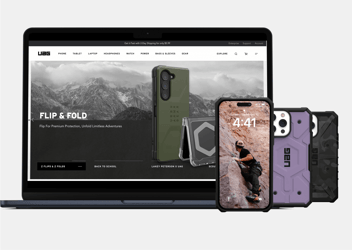
Lightning Fast App for Urban Armor Gear Users
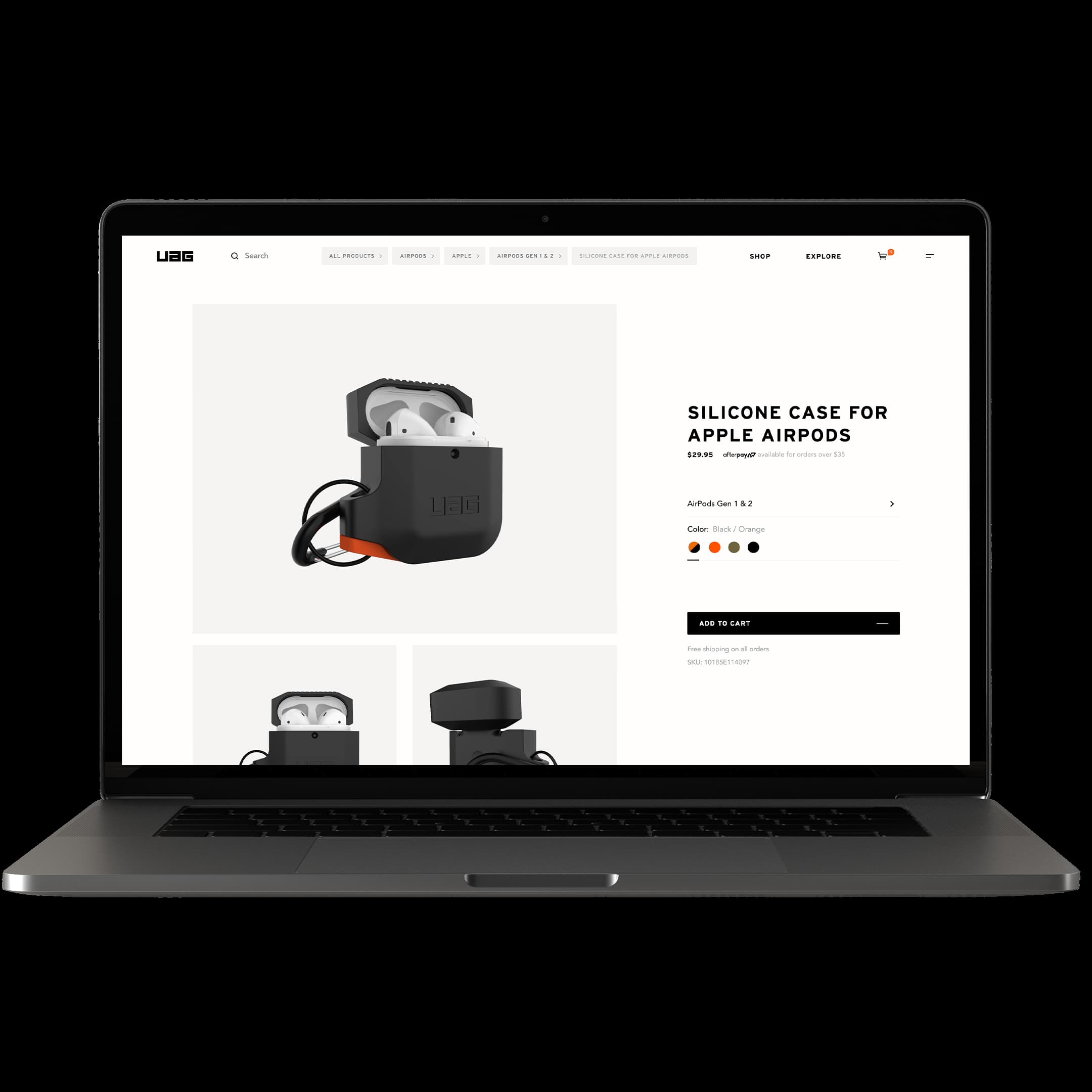
UAG is a top international brand for protective device cases. They asked us to build a completely new e-commerce website to increase usability, storytelling, brand expression, and performance. We worked closely with the talented team at UAG - this was a true partnership throughout the project.
Building a foundation
We started with user research and strategy workshops, building a solid understanding of the pain points, opportunities, and goals. We also analyzed the current site to discover what was working and what can be improved. This led to a game plan that would guide the rest of the project, User Personas based on data, and a vetted feature backlog that took user needs, business needs, and costs into account.
Information Architecture
Once we had a good understanding of the current features, new features to add, and features that will be implemented in the future, we got to work organizing everything into an intuitive and future-proof structure. UAG had run out of room to grow with their old site, so making sure this new structure works well into the future was very important.
Creative Direction
At Vincit, we try to get the direction locked down before starting on designs or wireframes. Since wireframes influence much of the layout, it’s important to have a solid creative plan before we get further into the process.
UAG has built a successful lifestyle brand with a die-hard fanbase that loves their content. Casey, the Creative Director at UAG, had a very specific brief. It went something like this: “Make it so easy to order, that while browsing our lifestyle content, I can buy a phone case at a red light before it turns green.”
We thought about this challenge through a few lenses
First, we need to remove all friction within the shopping flow - if a customer is to place an order within a 20 second window, they don’t have time for any unnecessary steps. The site should automatically detect which brand and device they’re using, serving up shortcuts and suggestions based on their most likely purchase. It should offer quick payment options based on their device, such as Apple Pay. It should remember their favorite categories, allowing them to bypass filters for devices they don’t own. The list goes on - we reimagined what a personalized shopping experience means.
Second, UAG’s content needs to be actionable. Any time a user sees a great case in a lifestyle video, they should be able to click through to the product page. If they are checking out a UAG Ambassador or Athlete, they should be able to buy that person’s preferred products. It goes both ways - the content should also be woven into the shopping experience, allowing customers to see products in action and giving them the confidence to purchase.
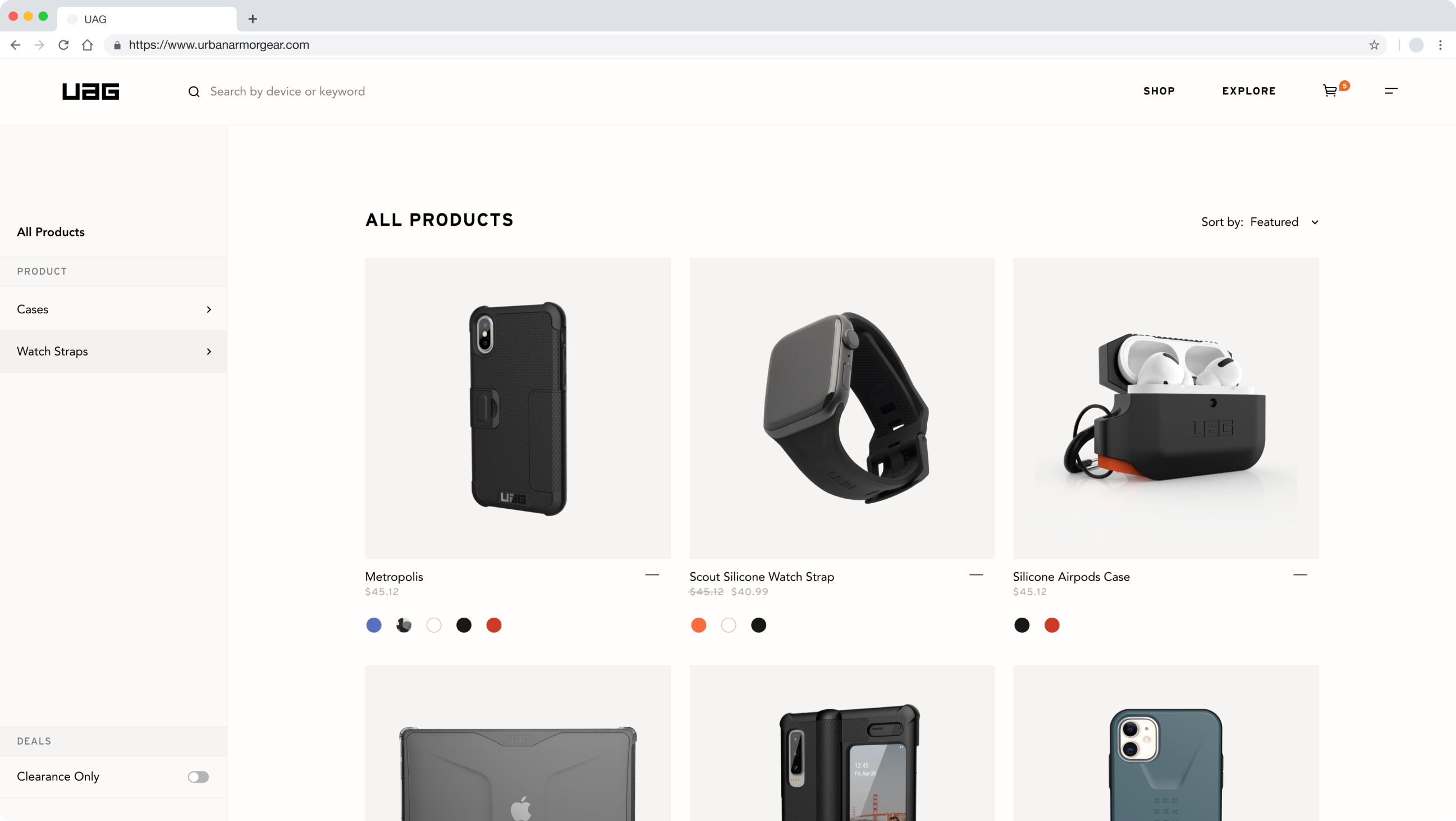
Oh, you thought we were going to talk about Creative Direction?
This is where Vincit does things differently. Usually, when companies talk about creative direction, they mean Art Direction (colors, typography, and design elements.) That’s a part of it, but the experience is more than the visual design. This strategy of focusing on storytelling and streamlined shopping gets woven into the Art Direction. But ok, let’s talk style.
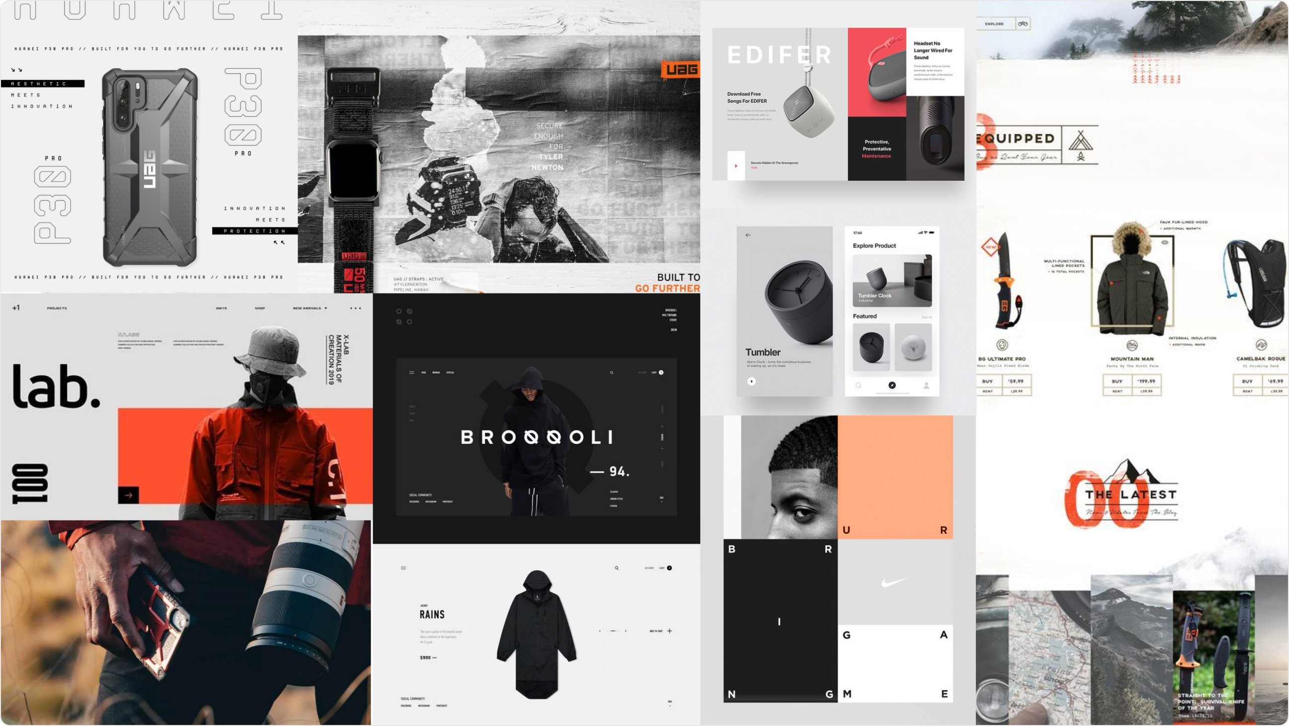
Our goal was to translate UAG’s brand style into a digital form that enhances usability rather than hurting it. We focused on the main themes of their brand: Rugged, Premium, Exhilarating, and Real. We made some interesting design decisions to embody these themes, such as our personal favorite: Replacing any white across the entire site with our “As close to white as beige can get” color to provide a custom, high craftsmanship atmosphere. We also pushed UAG to incorporate more small-form video content into the site, for example, in the new “Instagram Story” inspired hero sections.
We knew we needed to solve for both streamlined shopping and engaging storytelling. To accomplish this, we created two versions of our overarching themes. A simple and straightforward style to be used for all pages within the shopping flow, and a highly designed style to capture users’ attention when browsing lifestyle content. We then created intermediate styles to merge the two for a seamless experience, so as the user gets deeper into the lifestyle content, the design of the site gets more interesting. Once they decide they want to purchase, they’re back to clean and highly functional pages.
Wireframes
If you skipped to this section, you may be disappointed. At this stage of the project, many of the hard problems have been solved and decisions made. Wireframes provide both us and the client a communication tool and validation of our user flows and strategy, with quick sketches during the previous steps accounting for much of the iteration on structure and flows. That’s not to say that wireframes aren’t important. They’re a vital step for testing usability and providing answers to some of the remaining decisions. Linking up a full site prototype lets us quickly test these things, and provides our developers with the information they need to get started on building the site’s back-end.
UI Design
Since hierarchy and visual design have a huge impact on usability, we try not to linger in the Wireframe step for too long, ironing out all remaining usability decisions within the Design phase. Here, based on our strategy, creative direction, and wireframes, we pull everything together into a beautiful website. We designed page-by-page for all device sizes, making sure we built a consistent experience across devices, but gave some extra attention to mobile because it’s the most-used format. This works well with the agile process, allowing our design and development teams to work closely together.
Development
UAG uses Shopify Plus for their commerce platform. This presented an interesting challenge since typically companies build within Shopify using Liquid, Shopify’s templating language. In order to improve purchase speed and performance in a big way, we needed to use some cutting-edge technologies. To sidestep the usual limitations of Shopify, we built a custom site using React and Gatsby, connected it to Contentful CMS and the Shopify API, and set up a nice deployment pipeline with Netlify.
This has two major benefits: Gatsby, being a Static Site Generator, greatly speeds up page load times. Secondly, building the site using React opens up a huge pool of quality engineering talent that UAG can tap into if needed. Using Contentful for UAG’s lifestyle content also provides them with the ability to easily customize their content, spin up landing pages, and so on. We should also mention that this approach didn’t require migration of thousands of SKU’s and it retained UAG’s current process for managing products.
Expertise used
Impact
This is a great project to work on for both the engineering and design teams. Working closely with UAG’s creative team has been very rewarding, especially after seeing the creative ways they’re making the site their own with their content post-launch.
This is an ongoing project - Next up is Usability testing, A/B testing, more features, and ongoing improvements. Stay tuned!
